
We are now a couple of weeks into the renovation and it’s all starting to come together! But before I give you another progress update, I thought it was time to share the final design and all the different versions we came up with along the way.

It feels like the install is happening very quickly compared to how long it took for us to come up with the kitchen design. Before we started this process I had no appreciation for how all-consuming renovation and home improvement can be.
The biggest lesson for me so far is: no decision is made in isolation. I was chatting to an old friend who has lived through two major home renovations and she said it perfectly that ‘each decision spawns 20 more in its place’ haha.
And although sometimes it feels mentally draining thinking through all the minutiae like ‘will the coffee machine sit next to the toaster?’ and ‘which drawer will hold the utensils?’ and ‘where should the isolator switch to go?’ and ‘how many steps is it from the dishwasher to the crockery drawer?’ …in the end all that thinking has been so worth it because the final design is not only beautiful, but really feels like home, as something we came up with.
Of course, we could never have done it without the amazing team at Häcker kitchens – Clem our interior designer was so patient and indulged even my most bizarre initial ideas (see the first idea below which I am responsible for – yikes haha). She did a wonderful job at steering us, coming up with lots of concepts and it was a really fun creative process
The designs that didn’t happen
So, before I share the final design, I thought it would be fun to look back and show you the different iterations along the way.
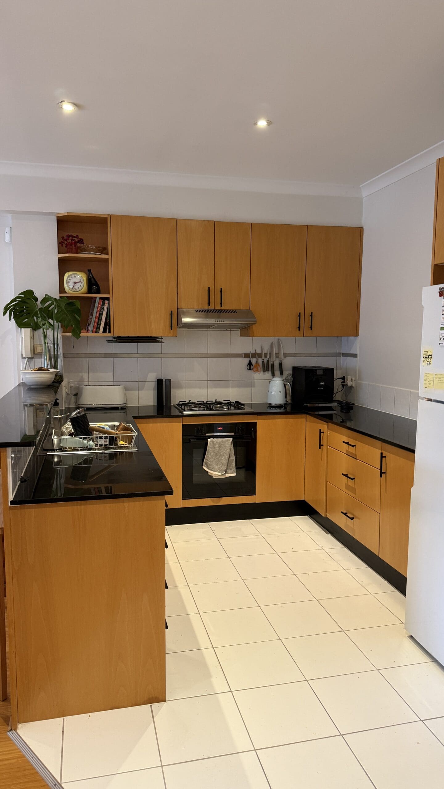
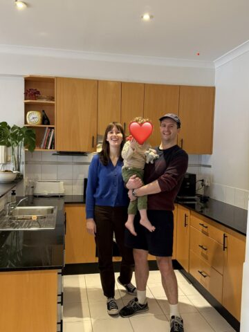
To refresh your memory, here’s a photo of the old kitchen or you can check out more images in Part One and Part Two.
Idea Number One
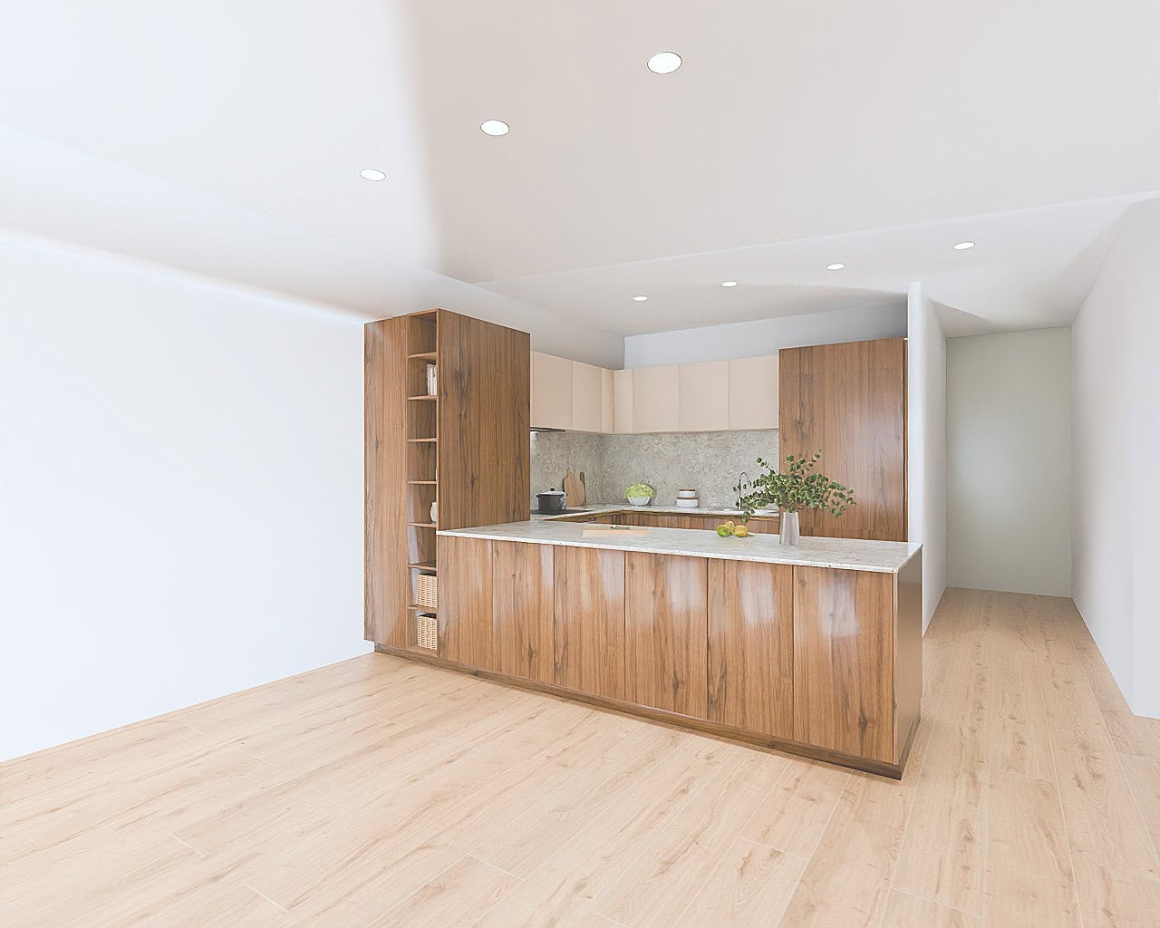
The worst of the lot and fully my own creation that the Häcker team obligingly mocked up. My idea was for that big corner column to be an appliance garage on the inner side and a living room cabinet on the outside. We asked for a deep benchtop with cabinets opening into the living room too for more storage. But that column would have totally closed off the space and was immediately ruled out.
Idea Number Two
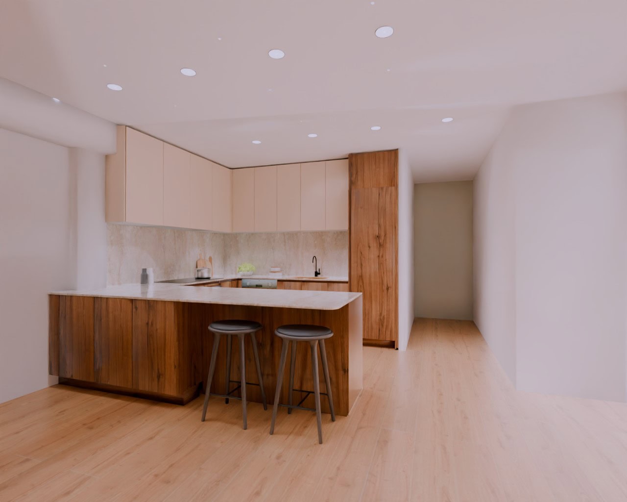
Thankfully, the Häcker team suggested another design which was much better. This one still kept the depth of the countertop that we’d asked for and had some cabinetry opening into the living room, but with a breakfast bar. Much more open and a big improvement on the old kitchen, with extra upper cabinetry. The issue with this design though was that although we loved the idea of storage, we realised when we mapped out the furniture placement that it was going to make the dining table and couch too cramped.
Idea Number 3
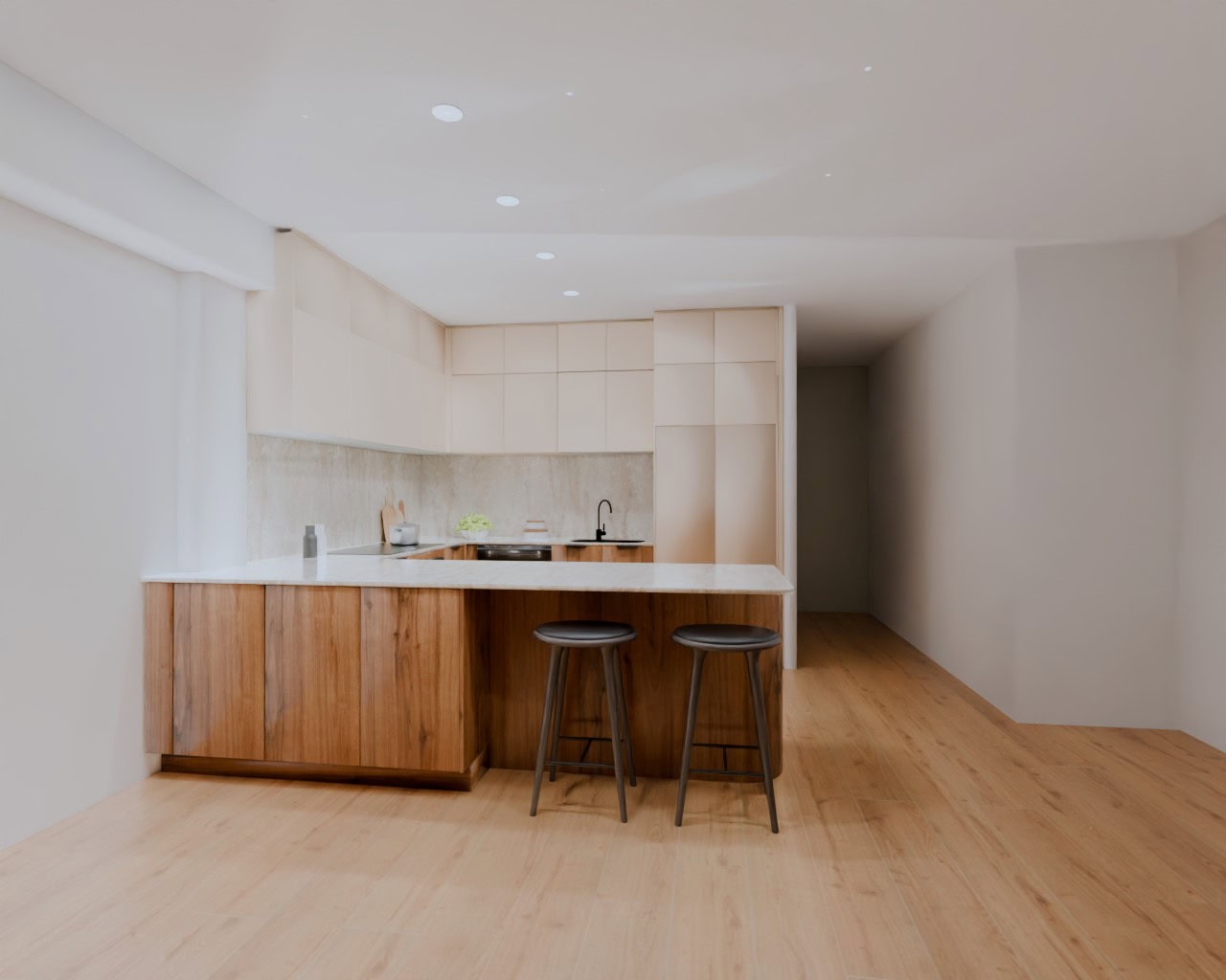
So, for the next version, we decided to give up the breakfast bar, and stopped trying to force living room storage into the kitchen.
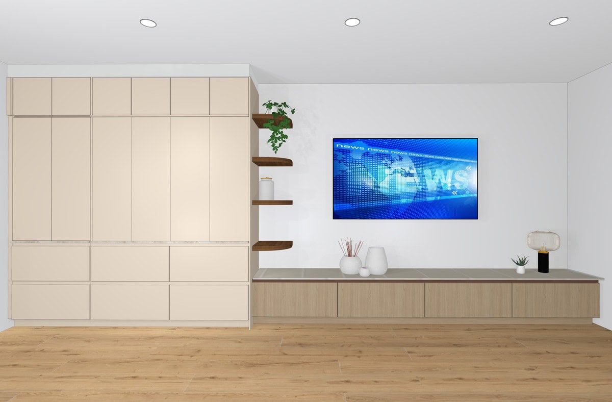
Now don’t get me wrong, we do still need the storage, but we decided to split it out as a separate project. As phase two of the renovation, the living room will have floor-to-ceiling cabinetry with a ‘family command center,’ the dedicated coffee station of my dreams, plus a media unit/bench. But we have parked that one until next year when we have more creative headspace to map out the full design.
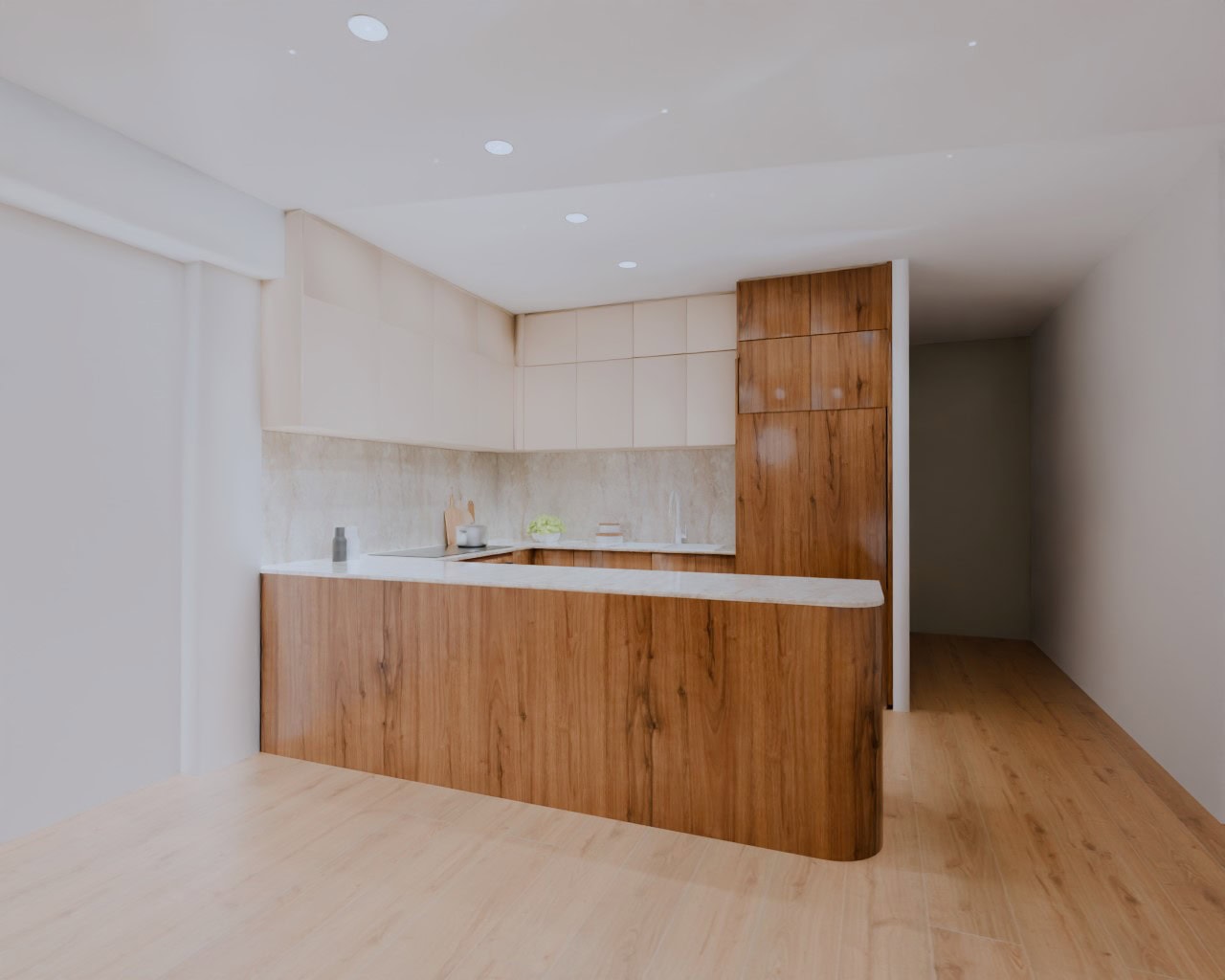
But in the meantime, in addition to reducing the kitchen footprint slightly, we added a soft curve to the outer cabinetry. This design was feeling MUCH closer and more modern, but something was still bothering me…
Idea Number 4
Now at this stage, I was questioning whether we wanted to stick with the U footprint. We had just gone with it by default as that was the shape of the old kitchen.
I was put off it for a couple of reasons:
- Practically, the corner cupboards are a pain to get into (even with the best lazy susan contraptions)
- Aesthetically, the U shape just didn’t feel like the modern contemporary look I really wanted in the townhouse
This is where Steve (husband) and I started to butt heads on the design because I REALLY started pushing for a galley kitchen instead. I.e. moving the cooktop to the back wall and having no bench on the short side.
Steve wanted to stick with the U for the bench space and partially to minimise connection changes with the utilities.
I’d browsed some new build townhouses for inspiration and it seemed like the galley was the more modern look, plus it felt very familiar to me from the kitchen at our old place.
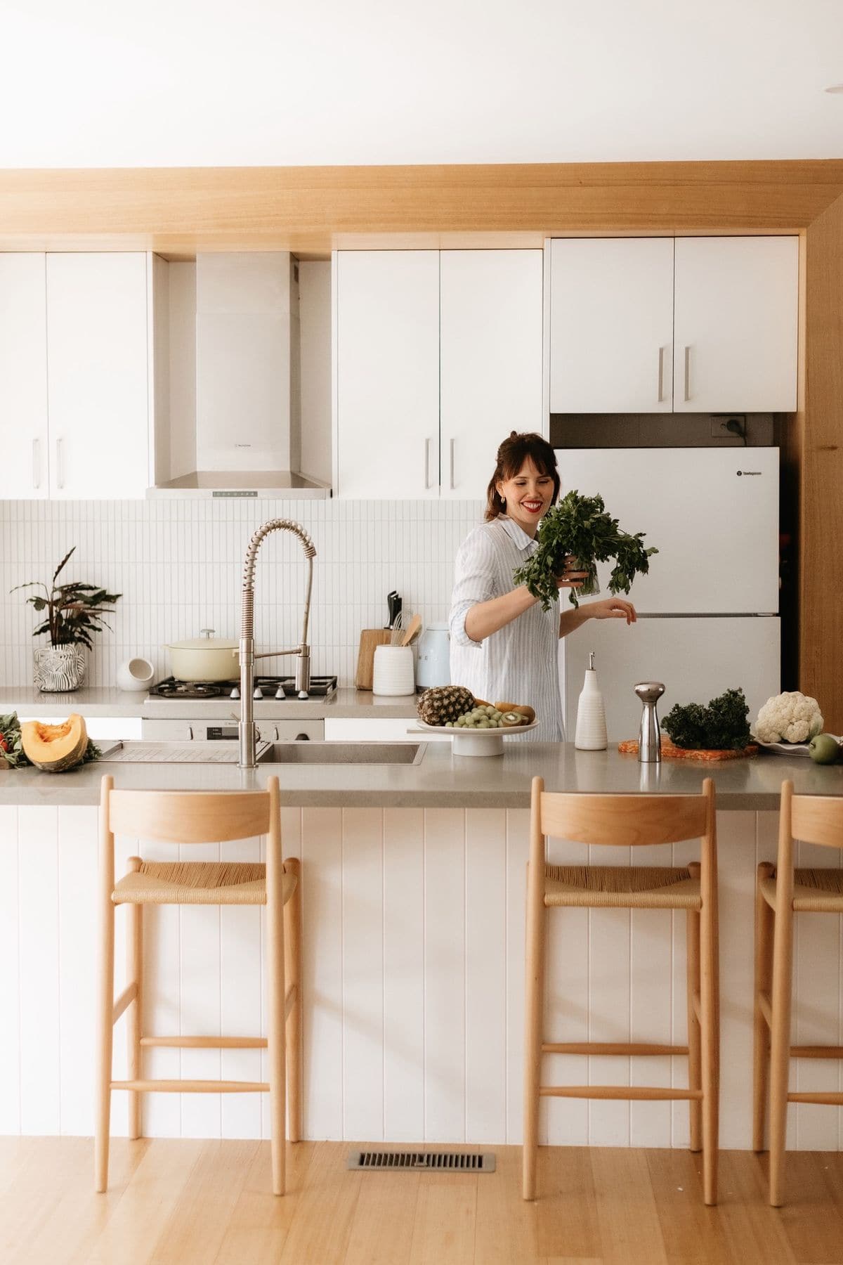
But the thing that eventually sold Steve on the galley was the practicality. When we mapped out the exact placement of the dishwasher, the fridge, the stove, microwave etc it became clear that although there is a little bit less bench space with a galley shape, the usable cabinet space increases dramatically. It also meant we could shrink the footprint a bit to make more space in the living room. Win win!
I also realised that given we were no longer squeezing in the breakfast bar, we could have some fun with the back of the island and tile it – inspired by my friend Sezzy Brown’s beautiful long tiled island (below).
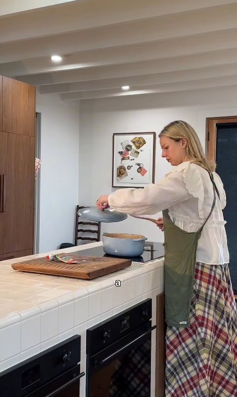
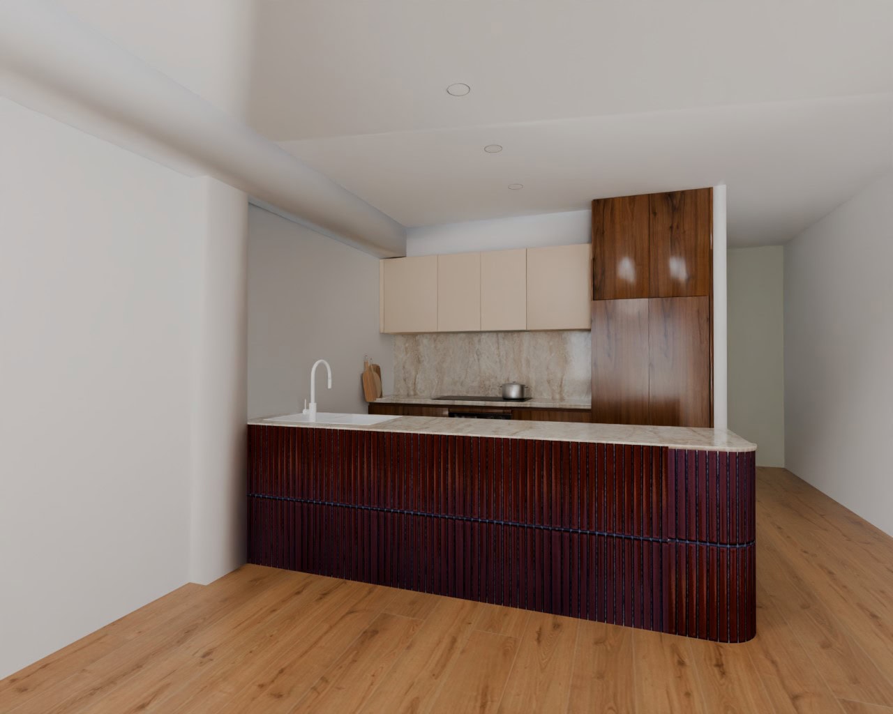
So this burgundy tile colour was one of the first versions. It looks cool, but darkened the space a bit and kind of reminded me of a pub haha
The final design
So for the final design, we just tweaked version four slightly and swapped the tiles over to a bone-color to match the upper cabinetry and brighten the space, with square tiles inspired by Sezzy’s.
So here she is! The only caveat is that the hardware will be gold (not white) and some pull handles added to the fridge (aka the large walnut column).
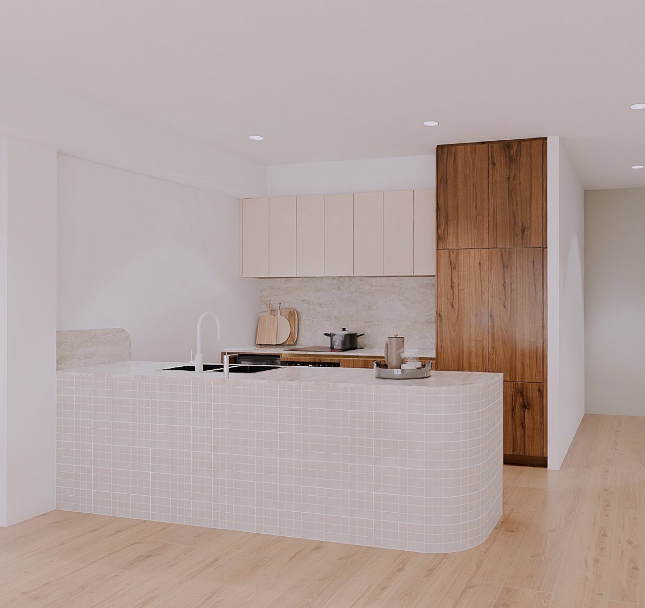
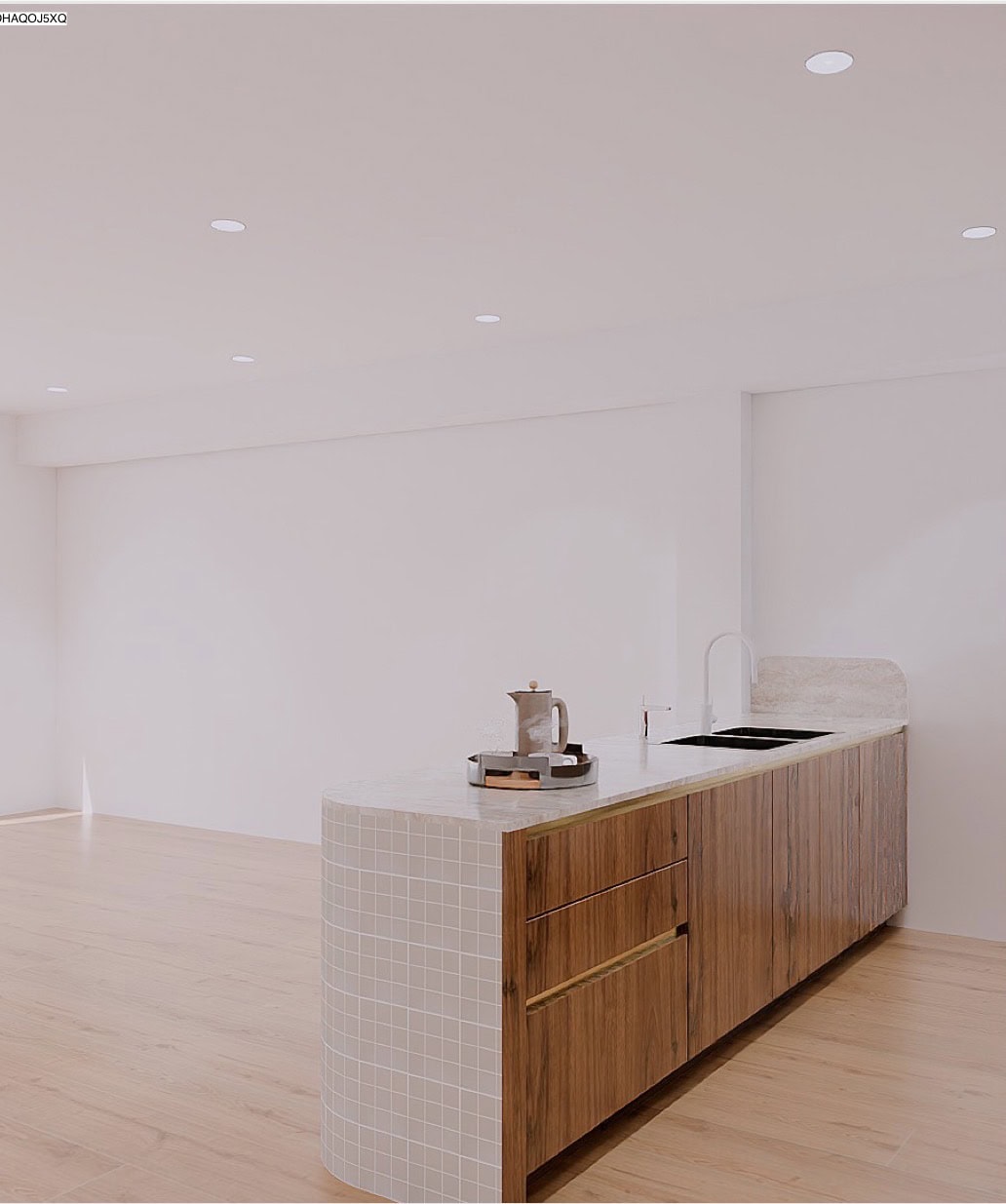
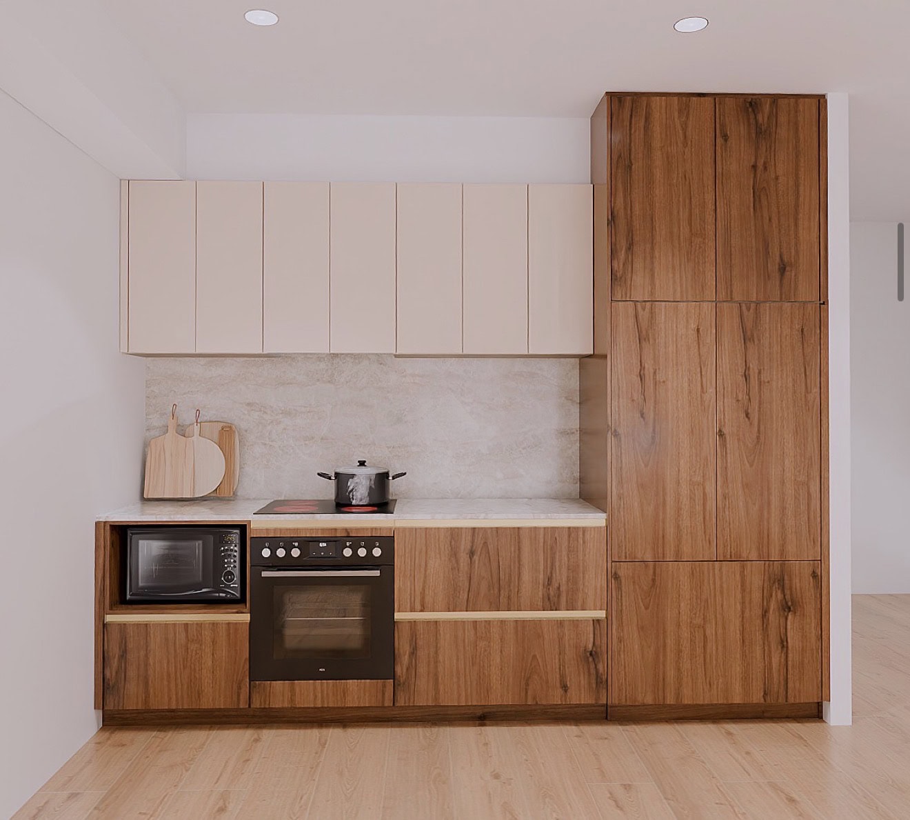
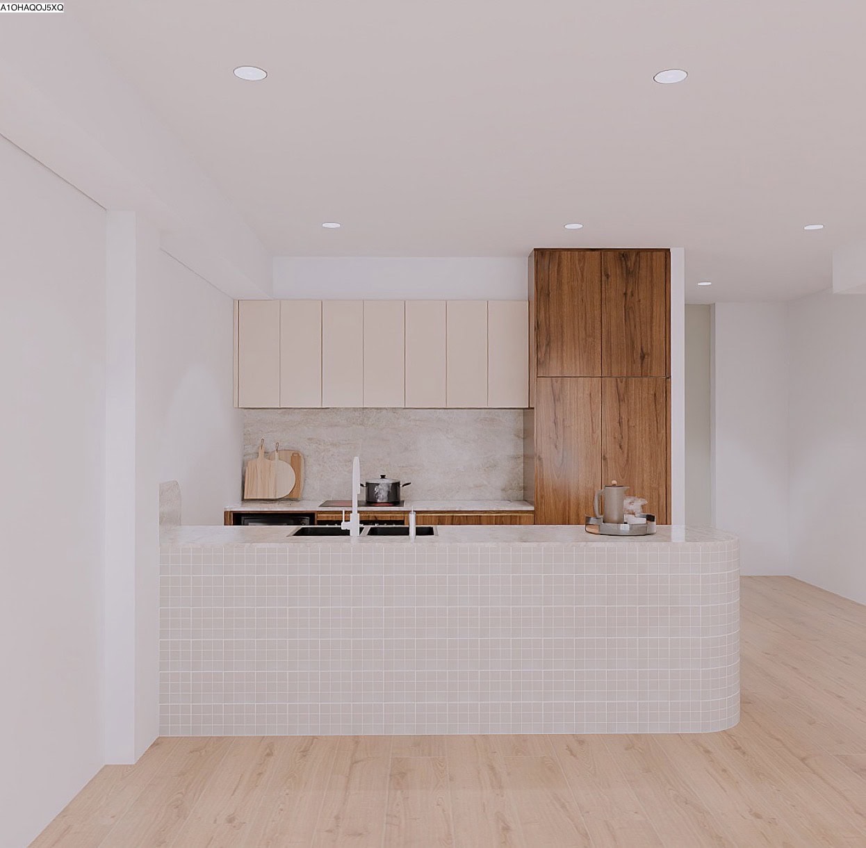
I am soooo happy with the final design.
Even Steve was saying just yesterday it felt like we didn’t have to make any compromises in the end because we both got the practical and design elements we were after.
So that’s it for now. If you’d like to go back and check out more of the reno story, here is Part 1 and Part 2 .
In the next part of the Renovation Diaries I’ll give you an update on the install progress. A lot has happened in just a week or so (yay).

Leave a Reply